From: John Conover <john@email.johncon.com>
Subject: Electronic Components Shipments Industrial Marketplace
Date: Wed, 14 Oct 1998 18:44:38 -0700
Although executive management is concerned with many issues, the most
significant issue in a corporation's durability is operational
strategy-which means controlling cash flow. It is a difficult
financial issue to address since cash inflow fluctuates month to
month, do to the market environment, etc. However, these fluctuations
do have general characteristics that can be used in strategic
financial planning.
To demonstrate a methodology for analyzing industrial market
fluctuations, I will derive the metrics for the electronic component
market in the United States. The data used readily available from the
US Department of Commerce, and contains the monthly shipments of
electronic components between January, 1979 and January, 1994,
inclusive. (The specific data used is labeled "MSEL367X, Electronic
Components and Accessories Shipments, by Millions of Dollars," and is
available on line from http://www.doc.gov/.)
The objective is to develop a conceptual model for the fluctuations in
industrial markets that:
1) Can be used in financial planning-specifically, we would like
to have an understanding of the duration of industrial market
expansions and contractions.
2) Should be conceptually useful-specifically, it must be
intuitive, and usable without elegant numerical
methods. Preferably, any calculations should be simple enough that
they could be done in one's head.
3) Should be capable of working with limited data-the reality is
that we do not have adequately concise data for industrial markets
in the US. Preferably, the model should be able to predict what
would be observed with such limited data.
What I will do is to state the model, and then offer a compelling and
lengthy argument as to why it is correct.
The model is that duration of the fluctuations in industrial markets
have a probability of 1 / sqrt (t). It is not complicated. What's the
probability of a "recession" lasting longer than four months? 1 / sqrt
(4) = 1 / 2 = 50%. And longer than two months? 1 / sqrt (2) = 0.707 =
71%. How about longer than seven months? 1 / sqrt (7) = 0.378 = 38%.
Note exactly what the model says-as an example, if you are two months
into a market's "recession", the chances of the "recession" continuing
two more months, or longer, is 1 in 2. The chances of it continuing 5
more months, or longer, is a little more than about 1 in 3. The same is
true for those times when the market is expanding, too. Simple as it
may be, it is astonishingly accurate.
The first and part of the second objectives have been satisfied. The
remaining question is why it works?
The reason is that industrial markets are fractal systems, and there
is a robust infrastructure in mathematics and economics that deals
with such things. However, I will approach the issue of intuitive
understanding through the construction of a single graph.
What we are discussing is the run length of industrial market
expansions and contractions. Let me propose the following prescription
for analyzing industrial market data. (You do not have to do this
analysis for other industrial markets-astonishingly, all markets have
the same contraction and expansion characteristics.) Suppose we have
market data that shows dollar shipments per month over a time period
of many years. For each month in our data, we simply count the number
of months until the market comes back to that value. That number would
be the run length of that market expansion or contraction, depending
on whether the market increased, or decreased respectively. We then
count how many of each run length we have, and make a graph of it.
Unfortunately, this is not exactly the information we want. Such a
graph would give us the likelihood that a run length's duration would
be EXACTLY 3 months, or 5 months, or whatever. For planning purposes,
we want to know the likelihood that a run length's duration would be
LONGER than 3 months, or 5 months, or whatever. We need the cumulative
sum of the run lengths, (which is a fancy statement that means we
simply want to add them up, and make a new graph.)
Although such data "munching" can be done on a spread sheet, there are
programs available that will do the same thing very expediently. (The
program I used for the generation of the attached graph was
tsrunlength, and available at
http://www.johncon.com/ndustrix/archive/fractal.tar.gz, and produced the data
for the attached graph in just a few seconds. The program is Open
Source, ie., free.)
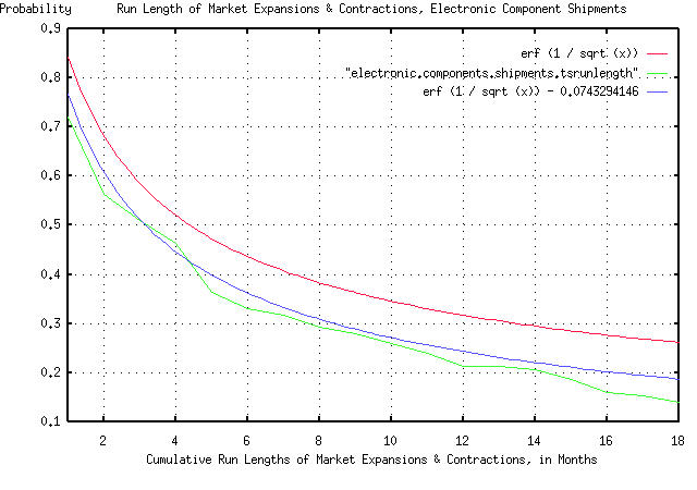
The formula listed above, 1 / sqrt (t), is not precisely true. It
actually has an error function in it-the precise, theoretical form is
erf (1 / sqrt (t)). In the attached graph, I used the formal version
to demonstrate the accuracies. The error function has virtually no
significance for t much greater than 1.
I now have to address the issue of limited data set size-there were
181 "points" in the data for electronic component shipments in the
data from the Department of Commerce. If you think about it, finding a
run length of longer than 181 months in the data for 181 months is
impossible. But I know, that given a much larger data set size, I
would find some. What's the chances of that happening? About 1 / sqrt
(181) = 0.0743 = 7.4%. So, I can now compensate my theoretical form,
erf (1 / sqrt (t)), to make it look like my empirical data from the
Department of Commerce. I just subtract 0.0743 from it to compensate
for the limited data set size-and our third objective is complete.
We have one remaining issue. And that is how intuitive is it? The
graph is compelling:
All the graph means is that if you want to find the chances of the
duration of an industrial market expansion or contraction being longer
than, say four months, you find 4 on the x axis, move up to the graph,
and left to the y axis, and read about 0.5 = 50%.  There are three
graphs displayed. The "real" graph is erf (1 / sqrt (t)), and is the
graph that should be used. The graph erf (1 / sqrt (t)) - 0.0743294146
is what we would expect to see if our data set was 181 months, and the
remaining graph is the empirical data from the Department of Commerce,
which consisted of 181 months. All in all, a respectable "fit" of
empirical data to our theoretical model.

There is one remaining question. What happens if we want to know the
characteristics of the duration of the run lengths of market
expansions and contractions in years, instead of months?
Astonishingly, it doesn't make any difference! The same rule holds
irregardless of the time scale-for which, I will offer compelling
evidence.

        John

--

John Conover, john@email.johncon.com, http://www.johncon.com/