From: John Conover <john@email.johncon.com>
Subject: Re: Electronic Components Shipments Industrial Marketplace
Date: Wed, 14 Oct 1998 22:28:07 -0700
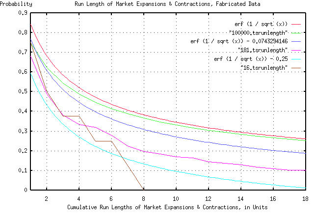
John Conover writes:
>
> So, the assumption that our model of the duration of expansion and
> contraction intervals in industrial markets can be calculated as
> having a probability of happening of 1 / sqrt (t) seems to be
> intuitively justified, irregardless of whether we are talking in
> months or years.
>

But there is more we can do, if you think about it. We have a general
model for the ups and downs of the industrial marketplace. To show how
that would work, if we take a random number generator, and start
summing random values to make a new data set, the statistics should
look like the Department of Commerce's data for electronic component
shipments. To do this, we could toss, say, a hundred coins in the air,
and subtract the number of heads from the number of tails, and add
that to a tally. And then do it again. And again, up to 181. We could
then use that as a data set, with our methodology to make a new
graph. It would be expected that the graph would look something like
the previous two graphs. (I didn't toss a hundred coins in the air,
181 times-I used the random number generator in a computer.)  Again,
the graph is compelling:
As before, all the graph means is that if you want to find the chances
of the duration of an industrial market expansion or contraction being
longer than, say four time units, you find 4 on the x axis, move up to
the graph, and left to the y axis, and read about 0.5 = 50%.  There
are six graphs displayed. The "real" graph is erf (1 / sqrt (t)), and
is the graph that should be used. In addition, there is a graph made
by tossing the coins in the air 100,000 times. It should agree with
the graph of erf (1 / sqrt (t)) fairly closely, (and it does.)

The graph erf (1 / sqrt (t)) - 0.0743294146 is what we would expect to
see if our data set size was 181 time units-the next graph was made by
tossing the coins in the air 181 times, (it was actually the data from
tossing the coins in the air 100,000 times, with everything beyond the
181'st toss cut off.) These two graphs should agree, and look like the
Department of Commerce data for electronic component shipments, by the
month, (and they do, at least reasonably for a data set size of 181.)

The graph erf (1 / sqrt (t)) - 0.25 is what we would expect to see if
our data set size was 16 time units-the next graph was made by tossing
the coins in the air 16 times, (it was actually made by taking every
twelfth data point from the 181 data points.) These two graphs should
agree, and look like the Department of Commerce data for electronic
component shipments, by the year, (and they do, at least reasonably
for a data set size of only 16.)

All in all, a respectable "fit" of empirical data, and manufactured
data-made by tossing coins in the air-to our theoretical model,
particularly considering the data set size was only 16 to 181 data
points.

        John

--

John Conover, john@email.johncon.com, http://www.johncon.com/