From: John Conover <john@email.johncon.com>
Subject: Cute graph of the DJIA
Date: 4 Feb 1999 10:00:58 -0000
I was doing some simulation work on the statistics of the Dow Jones
Industrial Average this morning and was using the tscoins(1) program
as the simulator. The tscoins program does not mimic the DJIA-it
generates a graph with the same statistics, (why one would want to do
that is a long story for another time,) using a random number
generator.
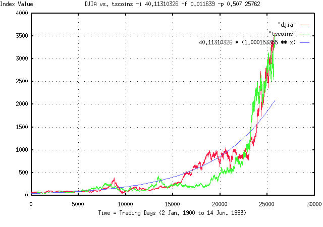
Attached is a graph of the DJIA, (2 Jan. 1900 to 14 Jun. 1993, by the
trading day,) the graph generated by the tscoins program, and an
exponential graph.
If one measures the statistics of the DJIA, they are as follows:
The average, avg, of the marginal daily returns is 0.000221.
The root mean square, rms, of the marginal daily returns is
0.011639.
This means that the likelihood of an up movement, P, is:
P = ((avg / rms) + 1) / 2 = 0.509497
These three numbers determine the statistics-all growth, volatility,
etc., is determined by these numbers.
The tscoins program is very simple internally-it generates a Gaussian
random number, adds it to a running sum, generates another random
number, and its it to the sum, and so on, (ie., it is a random walk
fractal generator.) The command line for the tscoins program was:
tscoins -i 40.11310326 -f 0.011639 -p 0.509497 25762 > tscoins
since there were 25762 trading days between 2 Jan. 1900 and 14
Jun. 1993. (The fractal model is a compound interest sort of thing,
ie., 1.00015^25762, and very small numerical inaccuracies can create
visible disparities after 25762 days-the actual number used in the
graph was -p 0.507, about a half of a percent less than the measured
value. All I did was to use the theoretical value, and decrease it so
that the graphs ended at the same value.)
The exponential graph is the expected gain, if averaged over infinite
time from the daily returns, R. R can be found from the formula:
R = ((1 + rms)^(P)) * ((1 - rms)^(1 - P))
= ((1 + 0.011639)^(0.509497)) * ((1 - 0.011639)^(1 - 0.509497))
= 1.000153355
and the exponential graph formula is 40.1131326 * (1.000153355)^t
where t is time, in trading days.
The exponential graph is what one would expect as returns from the
DJIA, after all the stochastic stuff had been smoothed out. The graph
produced by tscoins has the same stochastic statistics as the DJIA.
All three graphs are superimposed for comparison.
What is so interesting about this? If you look at the DJIA and tscoins
graph, they just look statistically similar, and both deviate from the
exponential graph in about the same way, (but, obviously, not at the
same places.)
For example, look at the DJIA at about 8000 days, (this down trend was
the 1929-1931 "crash".) Compare this to the "crash" at about 13000 in
the tscoins graph. Look at the big run up in both graphs starting at
about 23000 days. (That such things happen near each other is quite by
serendipity-the tscoins graph was generated with random
numbers. Usually, the graphs don't look so close, even though they are
statistically similar.)
The point is that the departures from the exponential graph in both
the DJIA and tscoins graphs is quite large, with much the same shape,
(although not at the same place, which is, obviously, what one would
expect.) Note that a factor of 2X, or more, from where they are
"supposed to be" is the norm, and not the exception in both graphs.
John
BTW, here is the measured statistics of the tscoins graph:
The average, avg, of the marginal daily returns is 0.000238.
The root mean square, rms, of the marginal daily returns is
0.011570.
This means that the likelihood of an up movement, P, is:
P = ((avg / rms) + 1) / 2 = 0.510285220
And R would be 1.000171088.
One can kind of comprehend the problem in numerical analysis of
fractals. They deviate so far from "average" that huge data sets are
required to get the "average". A century, by the day, was only
marginally enough data.
Look at what would have happened if one made measurements of the DJIA
at 5000 through 8000 days, or at 23000 through 25000 days-about a
decade each, of very inappropriate, misleading, and non-representative
data. (This is how fortunes have been lost in the equity markets using
quantitative analysis.)
FYI, as a least squares exponential fit to the DJIA graph:
e^(3.694195 + 0.000145t) = 1.000145^(25461.866810 + t)
= 2^(5.329597 + 0.000209t)
(the starting value in the exponential and tscoins graph was
1.000145^25461.866810 = 40.11310326,) and the tscoins graph:
e^(3.699252 + 0.000132t) = 1.000132^(27995.179290 + t)
= 2^(5.336892 + 0.000191t)
--

John Conover, john@email.johncon.com, http://www.johncon.com/