| john@email.johncon.com |
| http://www.johncon.com/john/ |
|
|
|
||
US GDP Historical Economic Business Cycle |
|||
Home | John | Connie | Publications | Software | Correspondence | NtropiX | NdustriX | NformatiX | NdeX | Thanks
|
The business cycle has perplexed economists, (Marx was obsessed with it,) for generations-with cyclic phenomena in the GDP estimated to be as few as 3 years, to as many as 60. But stochastic systems, such as geometric Brownian motion, have ups and downs, too, and the median duration of these ups and downs are, relatively, consistent with the estimates from the "prevailing wisdom," (to quote Keynes,) of the economists-and offers a rationale for the wide spread of economic estimates. US Business CycleThe analysis of the US GDP will include various eras between 1792 and the present.
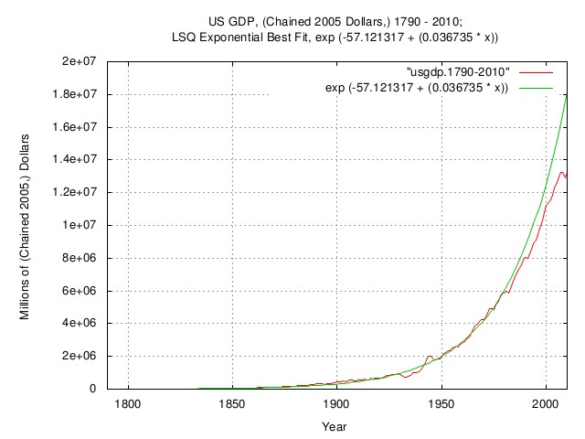
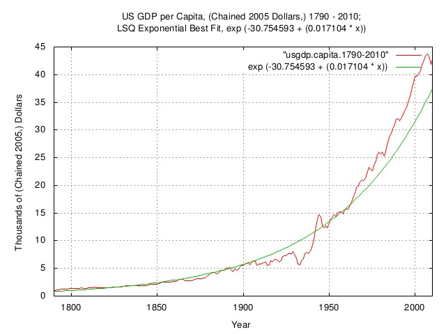
Figure I is a plot of the US GDP, chained 2005 dollars, 1790 - 2010; and the 1790 - 2010, LSQ median. (Note that median, in this case, means half of the time the empirical data is above the LSQ median, and half of the time, below.) Historically, the US GDP's annual rate of increase averaged about 3.7%. About 2% was due to the rate of increase of the population, and, about 1.7%. due to the rate of increase in productivity.
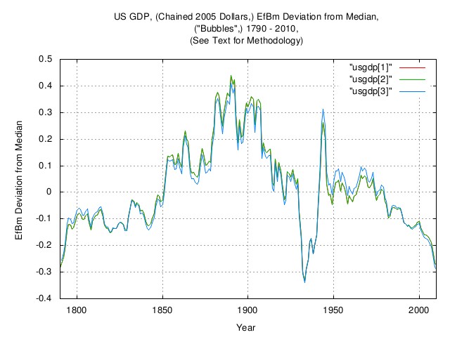
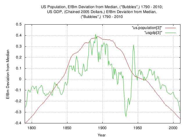
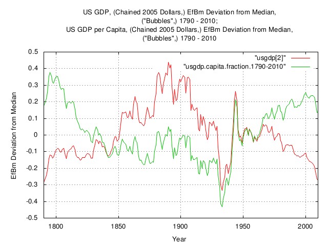
Figure II is a plot of the EfBm deviation, ("Bubbles,") of the US GDP, chained 2005 dollars, 1790 - 2010. If the US GDP was a perfect exponential, the graph would be a straight line at zero. The graph is the deviation from the straight line at zero, i.e., the productivity "Bubbles". The huge productivity "Bubble" of the Gilded Age, (about 1850 to 1930,) is clearly visible, (the GDP of other industrialized nations, England, Germany, and France, etc., show a similar phenomena.) The effect of the Great Depression "Bubble" decreased the US GDP by about a factor of 0.25 for about 9 years, starting in 1930, and the US GDP increased by about a factor of 0.25 in the era of WWII. Note that the US GDP has geometric Brownian motion characteristics, and the graphs can be made by three different methods, all of which should produce the same graph, within reason:
[1] and [2], (which are similar,) derive the EfBm deviation "from the outside in," while [3] "from the inside out"; it is a method of determining that the US GDP has geometric Brownian motion characteristics.
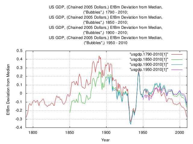
Figure III is a plot of the EfBm deviation, ("Bubbles,") of the US GDP, chained 2005 dollars, 1790 - 2010, by analyzing the data over different time horizons. The graphs are the median values-note that median, in this case, means half of the time the empirical data is above the LSQ median, and half of the time, below. If the US GDP was a perfect exponential, the graphs all would be a straight line at zero. The graphs are the deviation from the straight line at zero, i.e., the productivity "Bubbles," depending on the time horizon. Note that the graphs, from 1850, 1900, and, 1950 are all quite similar-from 1850 on was the industrialized age; prior to that, the US GDP was, primarily, agricultural and rural. Although the US GDP has geometric Brownian motion characteristics in both eras, the value of the variables changed with industrialization.
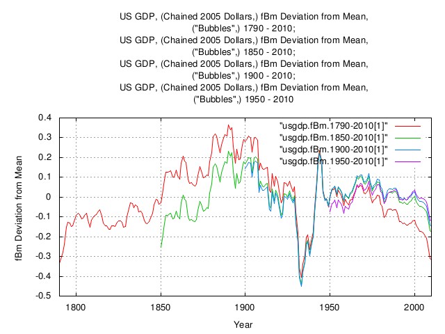
Figure IV is the same graphs as Figure III, but presents the mean of the EfBm deviation, ("Bubbles,") of the US GDP, chained 2005 dollars, 1790 - 2010, by analyzing the data over different time horizons.
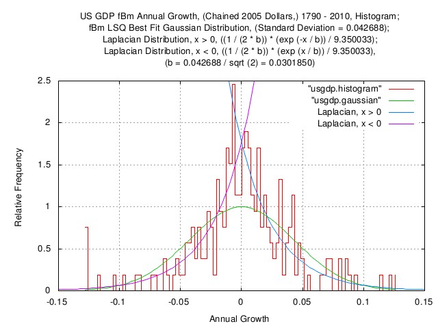
Figure V is a plot of the fBm, (i.e., marginal increments,) annual growth of the US GDP, chained 2005 dollars, 1790 - 2010, which is consistent with the US GDP having geometric Brownian motion characteristics. Included are LSQ Gaussian/Normal and Laplacian distribution best fits to the histogram. It is important to note the leptokurtosis of the Laplacian distribution-which offers a better approximation to the US GDP dynamics.
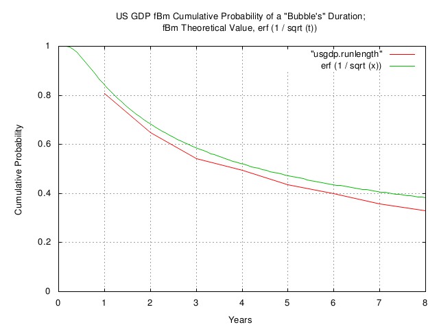
Figure VI is a plot of the fBm cumulative probability of
the duration of "Bubbles," (i.e., business
cycle,) of the US GDP shown in Figure III, and the
theoretical value for geometric
Brownian motion,
Note that the business cycle consists of one positive "Bubble" followed by a negative "Bubble", (or vice versa,) and if the positive, or negative, "Bubble" is "typically" 4.3 years in length, the cycle would be 8.6 years, "typically", which is very close to the 5 years, and, 7 to 11 years often quoted from empirical evidence. (The analysis is reasonably accurate, considering the differences in the eras represented by data spanning nearly quarter of a millennia-about 10% between the theoretical and empirical data.)
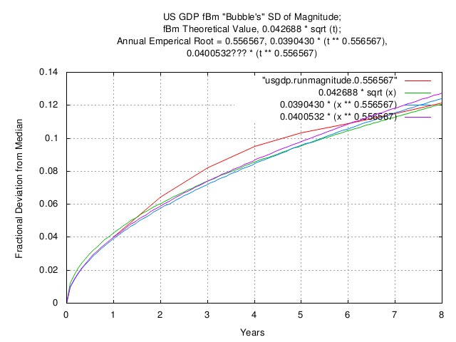
Figure VII is a plot of the standard deviation of the
magnitude of fBm "Bubbles," (i.e., business
cycle,) in the US GDP shown in Figure III, and the
theoretical value for geometric
Brownian motion,
The randomness in Geometric
Brownian Motion systems can be of different forms, too. If
the randomness has a Gaussian/Normal distribution, the shape
of the graph in Figure VII will be Related Analysis
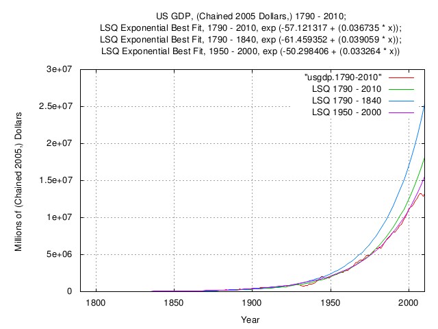
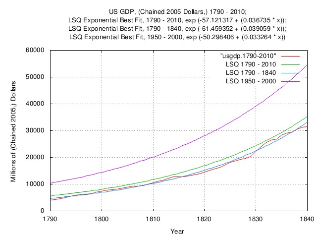
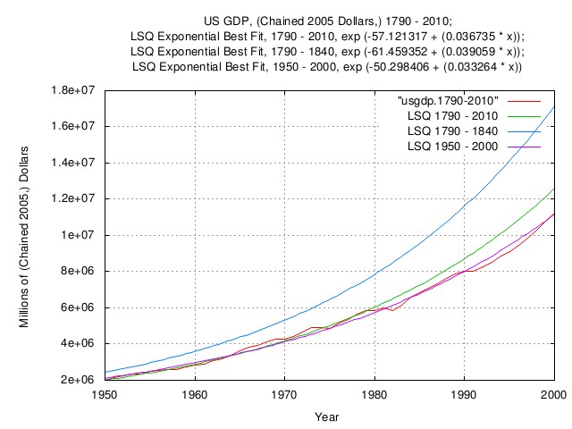
Figure VIII is a plot of the US GDP, from 1792 to 2010, with LSQ median best fit approximations based on historic data, from 1792 to 2010, 1790 to 1840, and, 1950 to 2000, omitting the effects of the Gilded Age "Bubble," about 1840 through 1950, from the last two. (Note that median, in this case, means half of the time the empirical data is above the LSQ median, and half of the time, below.)
Figure IX is an expanded plot of the US GDP in Figure VIII, from 1792 to 1840, with LSQ median best fit approximations based on historic data, from 1792 to 2010, 1790 to 1840, and, 1950 to 2000, omitting the effects of the Gilded Age "Bubble," about 1840 through 1950, from the last two. (Note that median, in this case, means half of the time the empirical data is above the LSQ median, and half of the time, below.)
Figure X is an expanded plot of the US GDP in Figure VIII, from 1950 to 2010, with LSQ median best fit approximations based on historic data, from 1792 to 2010, 1790 to 1840, and, 1950 to 2000, omitting the effects of the Gilded Age "Bubble," about 1840 through 1950, from the last two. (Note that median, in this case, means half of the time the empirical data is above the LSQ median, and half of the time, below.)
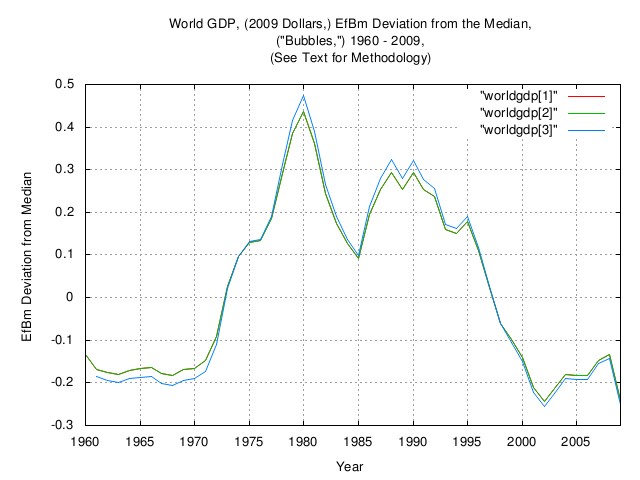
Figure XI is a plot of the EfBm deviation, ("Bubbles,") of the World GDP, chained 2009 dollars, 1960 - 2009. If the World GDP was a perfect exponential, the graph would be a straight line at zero. The graph is the deviation from the straight line at zero, i.e., the productivity "Bubbles". Note that the World GDP has geometric Brownian motion characteristics, and the graphs can be made by three different methods, all of which should produce the same graph, within reason:
[1] and [2], (which are similar,) derive the EfBm deviation "from the outside in," while [3] "from the inside out"; it is a method of determining that the World GDP has geometric Brownian motion characteristics.
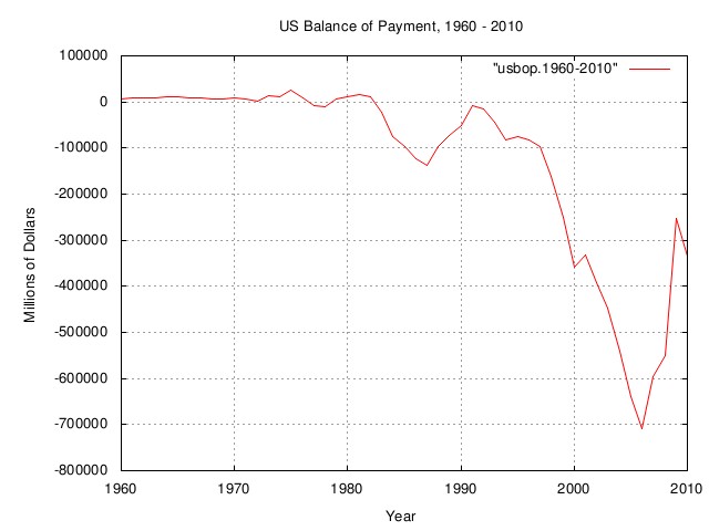
Figure XII is a plot of the US balance of payment, 1960 through 2010.
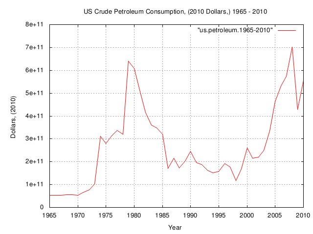
Figure XIII is a plot of the US crude petroleum consumption, 1965 through 2010, in 2010 nominal dollars, and represents that cost of of petroleum energy for the US, an industrialized society.
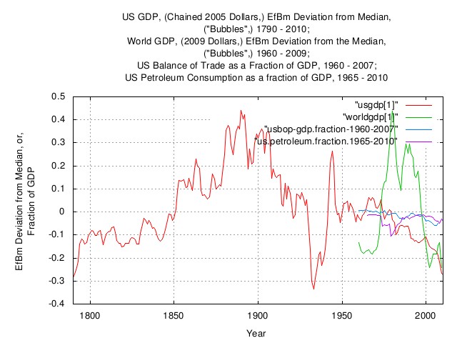
Figure XIV is an overlay plot of the EfBm deviation from the median for various data sets to indicate correlation of "Bubbles".
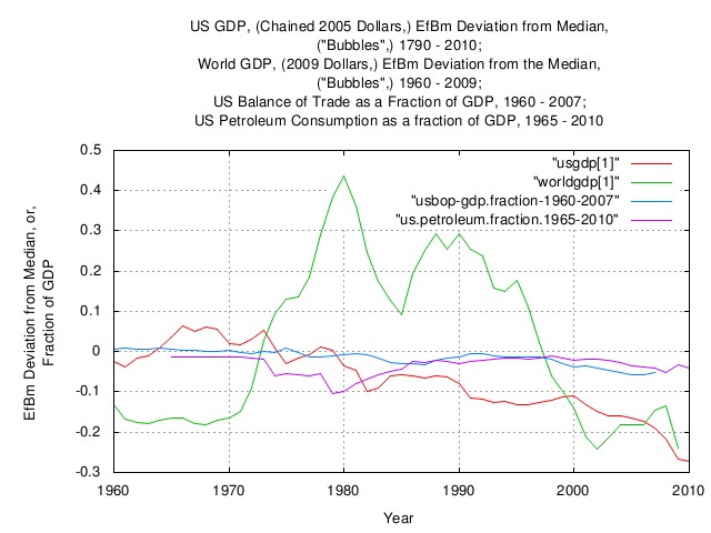
Figure XV is expanded overlay plot of the EfBm deviation from the median for various data sets to indicate correlation of "Bubbles", 1960 through 2010.
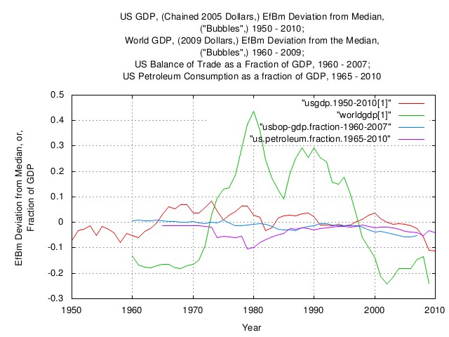
Figure XVI is expanded overlay plot of the EfBm deviation from the median for various data sets to indicate correlation of "Bubbles", 1950 through 2010.
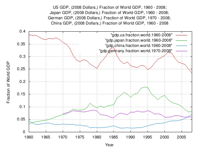
Figure XVII is a plot of the fraction of the World GDP produced by the US, Japan, Germany, and, China, 1960 through 2008. Since 2008, China has become second, surpassing Japan. The graph represents about 2/3 of the World GDP.
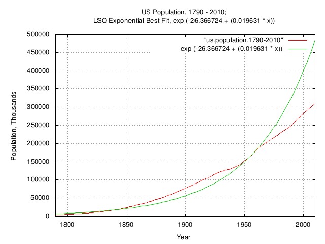
Figure XVIII is a plot of the US population, 1790 - 2010; and the 1790 - 2010 LSQ median. (Note that median, in this case, means half of the time the empirical data is above the LSQ median, and half of the time, below.) From 1790 to the present, the average annual increase in US population was about 2.0%, increasing to about 2.3% from 1850 through the early 1900's due to immigration. Starting in the early 1960's, the increase in US population decreased to about 1.1% annually due to family planning. Interestingly, during the Great Depression, 1929 through 1939, the birth rate decreased to about 1%, increasing to about 2.3% in the era of the post WWII "Baby Boomers."
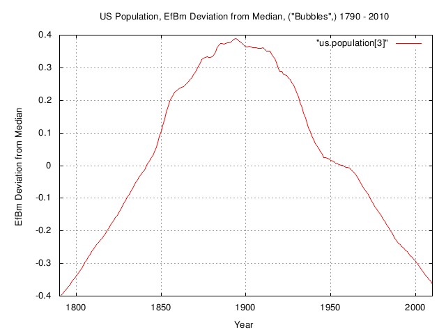
Figure XIX is a plot of the EfBm deviation from the LSQ median, "Bubbles," in the US population, 1790 through 2010. (Note that median, in this case, means half of the time the empirical data is above the LSQ median, and half of the time, below.) Immigration in the last half of the 1800's increases the value of the median, decreasing both ends of the LSQ. Starting in the early 1960's, the increase in US population decreased to about 1.1% annually due to family planning. Interestingly, during the Great Depression, 1929 through 1939, the birth rate decreased to about 1%, increasing to about 2.3% in the era of the post WWII "Baby Boomers."
Figure XX is an overlay plot of Figure II, the EfBm deviation, ("Bubbles,") of the US GDP, chained 2005 dollars, 1790 - 2010, and, the previous graph, Figure XIX, the EfBm deviation from the LSQ median, "Bubbles," in the US population, 1790 through 2010.
Figure XXI is a plot of the US population, 1790 - 2010; and the 1790 - 2010 LSQ median. (Note that median, in this case, means half of the time the empirical data is above the LSQ median, and half of the time, below.) From 1790 to the present, the average annual increase in US population was about 2.0%, increasing to about 2.3% from 1850 through the early 1900's due to immigration. Starting in the early 1960's, the increase in US population decreased to about 1.1% annually due to family planning. Interestingly, during the Great Depression, 1929 through 1939, the birth rate decreased to about 1%, increasing to about 2.3% in the era of the post WWII "Baby Boomers."
Figure XXII is an overlay plot of the previous graph's, (Figure XXI,) EfBm deviation and the EfBm deviation, ("bubbles,") of the US GDP per capita, chained 2005 dollars, 1790 - 2010. If the US GDP per capita was a perfect exponential, the graph would be a straight line at zero. The graph is the deviation from the straight line at zero, i.e., the productivity "Bubbles". ArchiveThe data presented here can be reconstructed, in its entirety, from the historical.economics.tar.gz tape archive file, which contains all data and references, thereto. The source code to all programs used in the analysis is available from the NtropiX site, tsinvest.tar.gz, and, the NdustrixX site, fractal.tar.gz, tape archive files. All use the "standard" Unix development systems of rcs(1) and make(1) to facilitate replication. It should be noted that many of the data set sizes are pitifully small-some as few as two hundred data points, (a standard error of about 7% of the standard deviation,) and conclusions can only be regarded as circumstantial. LicenseThe information contained herein is private and confidential and dissemination is strictly forbidden, except under the provisions of contractual license. THE AUTHOR PROVIDES NO WARRANTIES WHATSOEVER, EXPRESSED OR IMPLIED, INCLUDING WARRANTIES OF MERCHANTABILITY, TITLE, OR FITNESS FOR ANY PARTICULAR PURPOSE. THE AUTHOR DOES NOT WARRANT THAT USE OF THIS INFORMATION DOES NOT INFRINGE THE INTELLECTUAL PROPERTY RIGHTS OF ANY THIRD PARTY IN ANY COUNTRY. So there. Copyright © 1992-2016, John Conover, All Rights Reserved. Comments, questions, and problem reports should be addressed to:
|
Home | John | Connie | Publications | Software | Correspondence | NtropiX | NdustriX | NformatiX | NdeX | Thanks